How tersOS shows up.
Paper, ink, one highlighter. Everything you need to put tersOS on a slide, a poster or a post — and have it look like us — is on this page. When in doubt, use less.
The wordmark


- The full stop is part of the mark. It's tersOS. — lowercase “ters”, capital “OS”, period. A statement, not an acronym.
- Always use the SVG files — never retype the wordmark, even in Space Grotesk (its face). The files are in assets.
- Clear space: keep at least the height of the “OS.” block free on all sides. Minimum width 90 px on screen, 24 mm in print.
- Never recolor it, add a shadow or glow, or stretch it.
- Never place the paper version on photography or dark grounds — that's what the ink version is for, and vice versa.
- On busy photos, put the wordmark on a solid paper or ink band, not directly on the image.
Color
The palette is a printed page: cool near-white paper, blue-black ink, one yellow highlighter. A typical promo is ninety percent paper and ink; yellow touches three or four words. Click a chip to copy its value.
- Yellow is a highlighter, never a glow. No gradients, no auras, no glassmorphism, no yellow text on white.
- Accent discipline: yellow is the workhorse. Grape and lavender appear only around TersAI. Punch appears at most once per page, on the offer. Never all three at equal weight.
- Warm cream backgrounds are betastudio territory (our parent company). If it looks cozy-beige, it's drifted — pull it back to paper.
- Dark surfaces appear three ways: the closing ink band, product screenshots framed as plates, and full-bleed tershouse photography under an ink scrim.
Type
Coworking got better. Its software didn't. Until now.
Weights 400–600. Italics for emphasis, the marker for the one phrase that matters. Headlines read like magazine covers: short, declarative, sentence case.
Body copy is Inter, set generously. It talks about real operations — parcels at the front desk, tabs that close at month-end, ten TVs on two floors — in plain sentences a person would actually say.
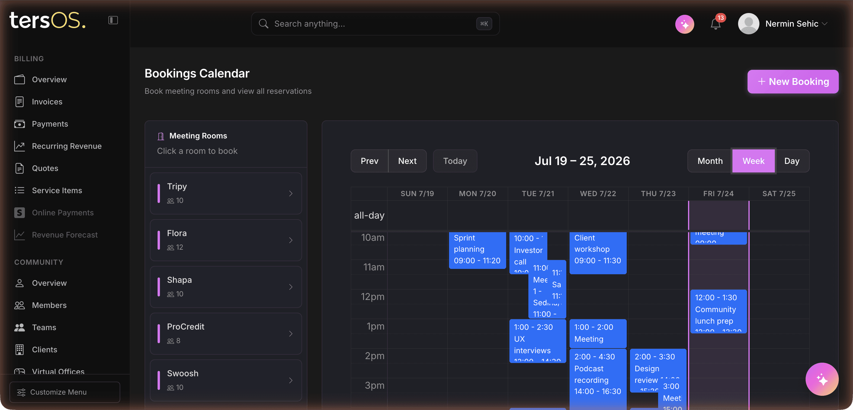
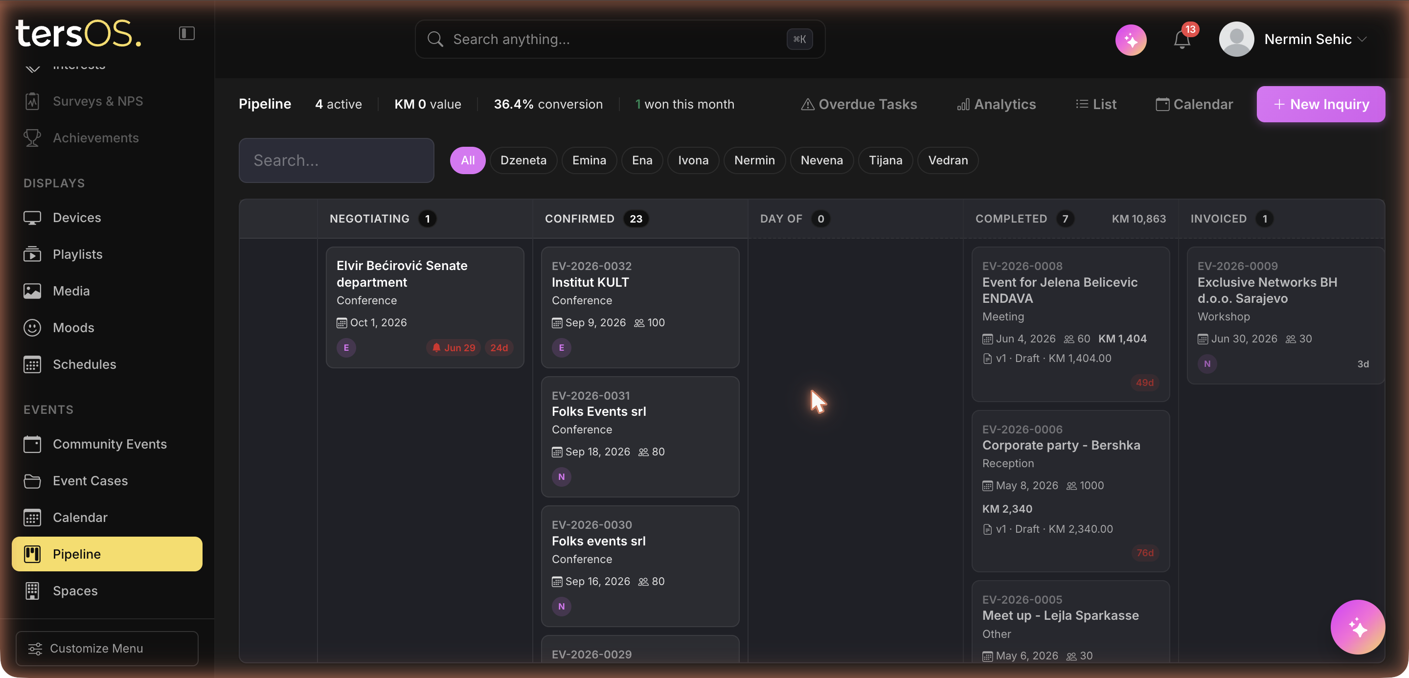
fig. 01 — the backoffice · app.tersos.io · captured live
Small, uppercase, letter-spaced. Used for figure captions, section kickers, indexes and timestamps — the texture that makes pages feel printed.
- All four faces are free on Google Fonts: Fraunces, Inter, JetBrains Mono — and Space Grotesk, which is reserved for the wordmark only.
- In decks where fonts can't be embedded, fall back honestly: Georgia for headlines, Arial for body, Courier New for captions. Don't substitute a different “fancy” serif.
Voice
WeWork upped the game of coworking. tersOS ups the game of coworking software.
- Human and concrete. Name real things — rooms, parcels, invoices in KM — not “solutions” or “workflows”.
- Proof over hype. tershouse is the evidence (“built by people who run a space”), never “the system” itself — tersOS is multi-tenant.
- Plain verbs, sentence case, no exclamation marks. Confident category-raiser, not a scrappy pitch.
- Banned words: seamless, empower, leverage, revolutionize, supercharge, all-in-one (say “one system” instead).
- Yes: “Every room, booked without a single Slack message.”
No: “Seamlessly optimize your space utilization.” - Yes: “The 2am booking follows the same rules as the 9am one.”
No: “AI-powered workspace innovation, 24/7.” - Yes: “Ten TVs on two floors, one dashboard.”
No: “Enterprise-grade digital signage at scale.”
tersOS is the operating system for coworking spaces — bookings, members, billing, events, digital signage and an AI assistant in one system. It's built by the team behind tershouse, a working coworking space in Sarajevo, and it runs that space every day. Learn more at tersos.io.
Imagery
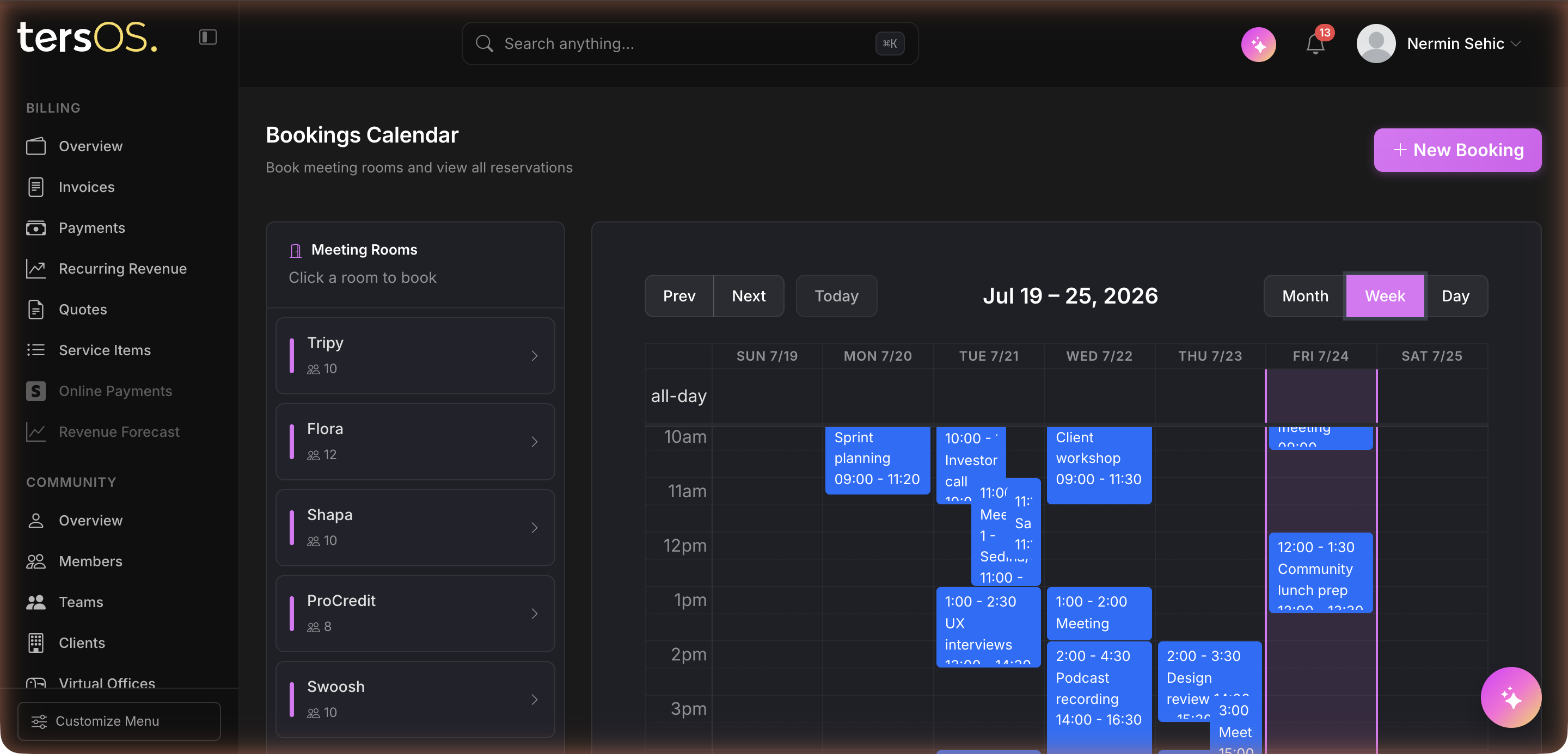
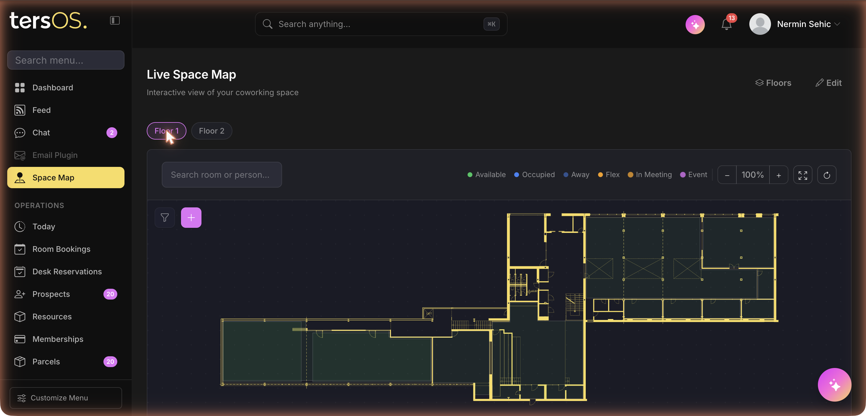
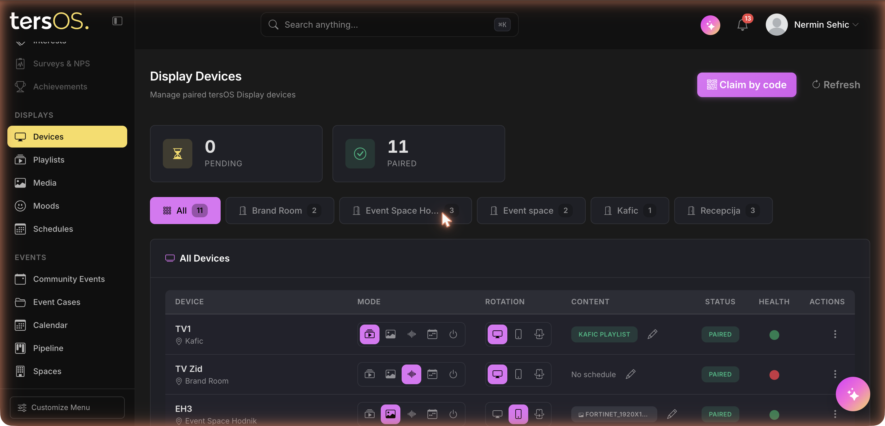
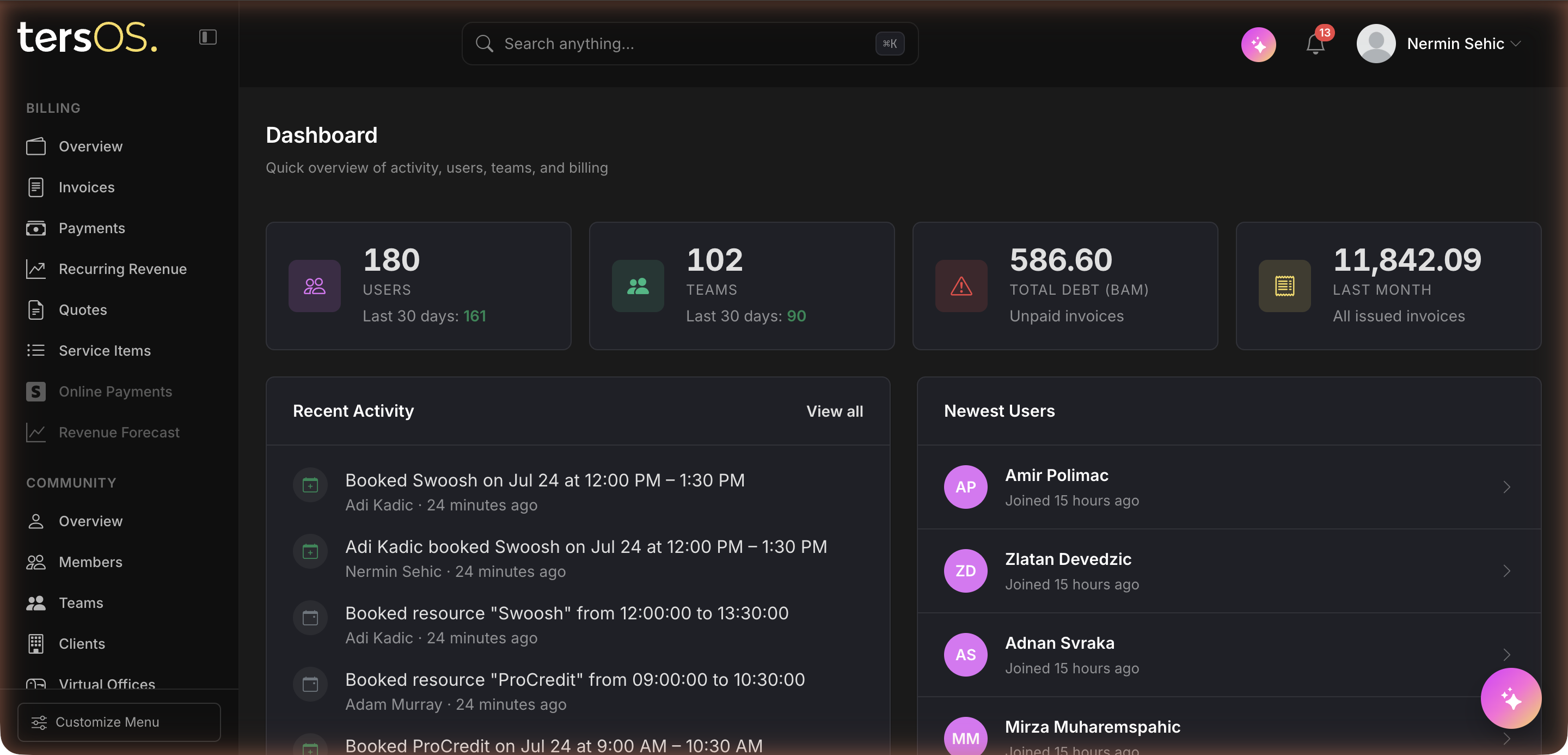
Dark product UI never floats on a dark slide. It sits framed on paper — white mat, hairline border, mono caption — like a plate in a printed book. Use the approved screenshots from assets; they're captured from the live system, not mockups.
The real tershouse library (shot july 2026) lives at tersos.io/photos/ — amphi, booth, conference, coworking and office series. Use it before any stock. Every photo gets an honest mono caption; never label stock as tershouse.
Full-bleed photography is a hero move: photo, ink scrim, paper type — at most twice per page or deck. Everywhere else, photos stay matted with a caption.
In practice
- Paper background, ink text. One Fraunces headline per slide with a single yellow-marked phrase.
- Mono kicker top-left (“01 — bookings”), generous margins, hairlines instead of boxes.
- At most one dark slide per section — and only to show the product, framed as a plate.
- Same recipe at 1:1 or 4:5. The yellow marker stroke is what makes us recognizable at scroll speed.
- One idea per tile: a marked headline, or a plate, or a photo with a mono caption — not all three.
- Wordmark small, bottom-left or bottom-right, always from the SVG.
- Paper may go pure white on press; ink stays #17181C — never 100% black.
- Yellow prints as a solid spot block behind words, drawn slightly past the text like a real highlighter.
- Captions in mono, small. If it looks like a magazine spread, it's right.
Assets
- tersos-logo-light.svg — for paper and light surfaces
- tersOS-logo.svg — for ink and dark surfaces


- the bookings week · the live space map · the display fleet · the venue pipeline · the dashboard
- Captured from the live system. Always present them as plates (white mat, hairline border, mono caption) — never floating on dark.
questions or new asset requests — hello@tersos.io